TRIZ and Design
Graham Rawlinson
Graham@dagr.demon.co.uk
If you have read articles on TRIZ by me before you will know that one thing I like to do is apply TRIZ to everyday life. I have reported in previous journals ideas relating to TRIZ and decorating. I would now like to take you through the journey I made with TRIZ and design for redecorating my whole house, a journey which entails an increasing use of TRIZ room by room, until in the end we had (my son and I) some firm ideas about TRIZ and design which really works!
In the earlier article we were using TRIZ simply to solve technical problems, like removing wallpaper, applying paint using unusual resources like an oil can, and getting paint lines to look straight (by using TRIZ Principle Segmentation, if you create a line which is non-uniform - spots say - then the line looks more straight than if it is continuous).
But basically the design of the room was fairly standard, though we did choose to use external light (a bright green from trees outside) to enhance the colour readmitted from the wall paper.
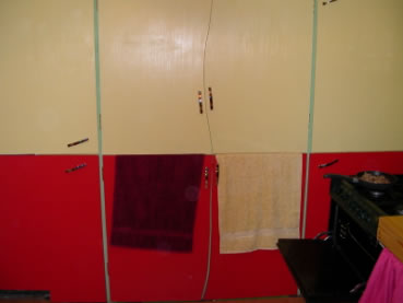
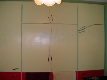
In the second room, a bedroom, we chose to segment the colours more, so the lower walls were a darker green than the upper walls, and the rugs were also a matching green. For the next bedroom we were ready to apply Trend of evolution to a greater extent. The segmentation of colours was still applied to upper and lower walls, but this time the lines of separation on each wall were complex curves, running from ceiling downwards, leaving a gap and then from floor back up with a slightly different curve. This continued around the room. The interesting effect was to lessen what could have been an over dominant red in the lower part of the wall.
The next room was a small bedroom which was to be converted to the office but without losing the potential to put a small double bed in for guests on occasions. As this presented greater contradictions for use of space this would provide more opportunities for TRIZ.
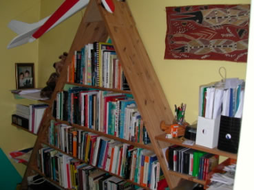
The first function tackled was the design of the bookshelves. They had to store a lot of books and papers and office stuff but they must not take up too much room.
Combining Principles of Asymmetry, Segmentation, Another Dimension led to the making of the main shelves as an A frame between two walls, with either leg of the frame resting against the outer wall. This meant that the main structure was mostly self-supporting and was very easy to make. Instead of many uprights to hold the weight of shelves, all needing to be secured, the system was mostly self-standing. Shelves inside the A frame were put at different heights (segmentation and non-uniformity) as were the shelves resting on the outer frame. Not only did this make the whole structure need far fewer securing points it also looked great (well, beauty is in the eye of the beholder perhaps). But best of all, because books and papers are all different sizes the storage space in the shelving system was much greater. The usual gaps that occur above small books put on deep shelves was not evident. In fact the system stored so much that space was left over after storing all the stuff that had previously been put on the same shelves in an upright rectangular design.
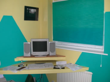
The A frame shape suggested a new segmentation of colours for lower and upper walls. The darker colour was again chosen for the lower wall and painted as a repeated tooth shape around the walls (the tooth shape came from the inner A shape with the top cut short). The computer desk was made to match this shape as triangular shelving on the far wall. At that height is also allowed a bed to be placed under it but not completely covering the bed end, so making it easy to get in out of the bed.
So by choosing to use other dimensions and other angles than right angles we had maximised use of space and creating some interesting visual effects.
The final room reworked was the kitchen. Here we had even more contradictions because there was more functionality required. Asymmetry, other dimensions, local quality and segmentation helped create a novel design.
The first decision was to place almost all of the function of storage in one place, so the end of the kitchen became one large floor to ceiling cupboard.
The wide upright struts enabled us to use the width of the struts to allow curved cuts in the doors without revealing gaps between them. The gap line wavered, plant like, from floor to ceiling.
By placing most of the functional storage in these cupboards there were no other cupboards on the walls and so the sense of roominess increased considerably. There remained the issue of worktop space. One worktop was simply a curved piece of maple. That was an easy decision, replicating the curves of the cupboard doors. The second worktop area was around the sink.
The usual rectangular sink and draining board would not fit the design at all, and also seemed to use space which at times had a different function.
At times the area could be used for preparing food and at other times for washing the dishes and such like. We did not think it too easy to segment the sink in time, sometimes being there and sometimes not, as that would require some very quick fit plumbing! But we could segment the use of the worktop area in time, sometimes being a clear area for preparing food and sometimes being an area for washing up.
So the draining board could be moveable. We decided that a simple large tray would suffice, being there to protect the worktop from metal damaging the surface, but removable to under the sink when not in use.
This enabled us to have a very simple round sink and a clean and clear worktop area.
To finish the design the tiling behind the sink worktop was of matching colours but the tiles were of two sizes, very large and very small, which allowed us to play with the patterns to fill in the space and make it non-uniform, more like a work of art!
There were many other uses of TRIZ in the practical �how to do it� world of building the worktop and cupboards and the required plumbing. But the suggestion is that it was the use of TRIZ in thinking about design that was most fruitful.
It was not that we would not have seen some of the ideas in magazines and such like, but TRIZ gave us the courage to explore the ideas systematically, and as we did so we got more and more willing to take risks with the design. This is one of the major benefits of using TRIZ. Maybe you could use other approaches to solving the problems and contradictions, but with TRIZ you can be confident about the kinds of decisions that TRIZ suggests.
TRIZ and design
Good design is about combining good functionality with good aesthetics. Fortunately when using TRIZ these seem to go together.
Any parameter, or feature, can be segmented, shifted in dimensions, made more non-uniform, moving from straight lines to curves and complex curves.
Increased use of asymmetry not only seems to look better but usually supplies more possibilities of functionality, with some parts able to deliver different functions to other parts.
It is easy to use any of the 40 Principles as a �What if?� question, and combining these with separation in time or space, trends towards non-uniformity and complexity, using Ideality to guide choices, we can have a lot more fun and come up with ideas which we can trust will be heading in the right direction.
The more I use TRIZ in an easy way, just for everyday decisions, the more I trust that it works. People seeing the design decisions we have made through the house are making very positive comments, including that they are not so sure they would be so brave! Well, when we started we were not so brave either. So now it is back to the first room to see what might be done to develop that room!
All comments welcome.
Graham Rawlinson
Graham@dagr.demon.co.uk
|
�
Copyright 1997-2005 CTQ Media LLC |